Atlántida, Corazón del Caribe Centroamericano.
The tourism brand of Atlántida, a department on the Caribbean coast of Honduras, and the manual that sets it out, in Spanish: the name, the logo and how it was built, colour, type, stationery and the brand in use. Below, the cover and seven of its spreads.
Work done at TRM, 2014.
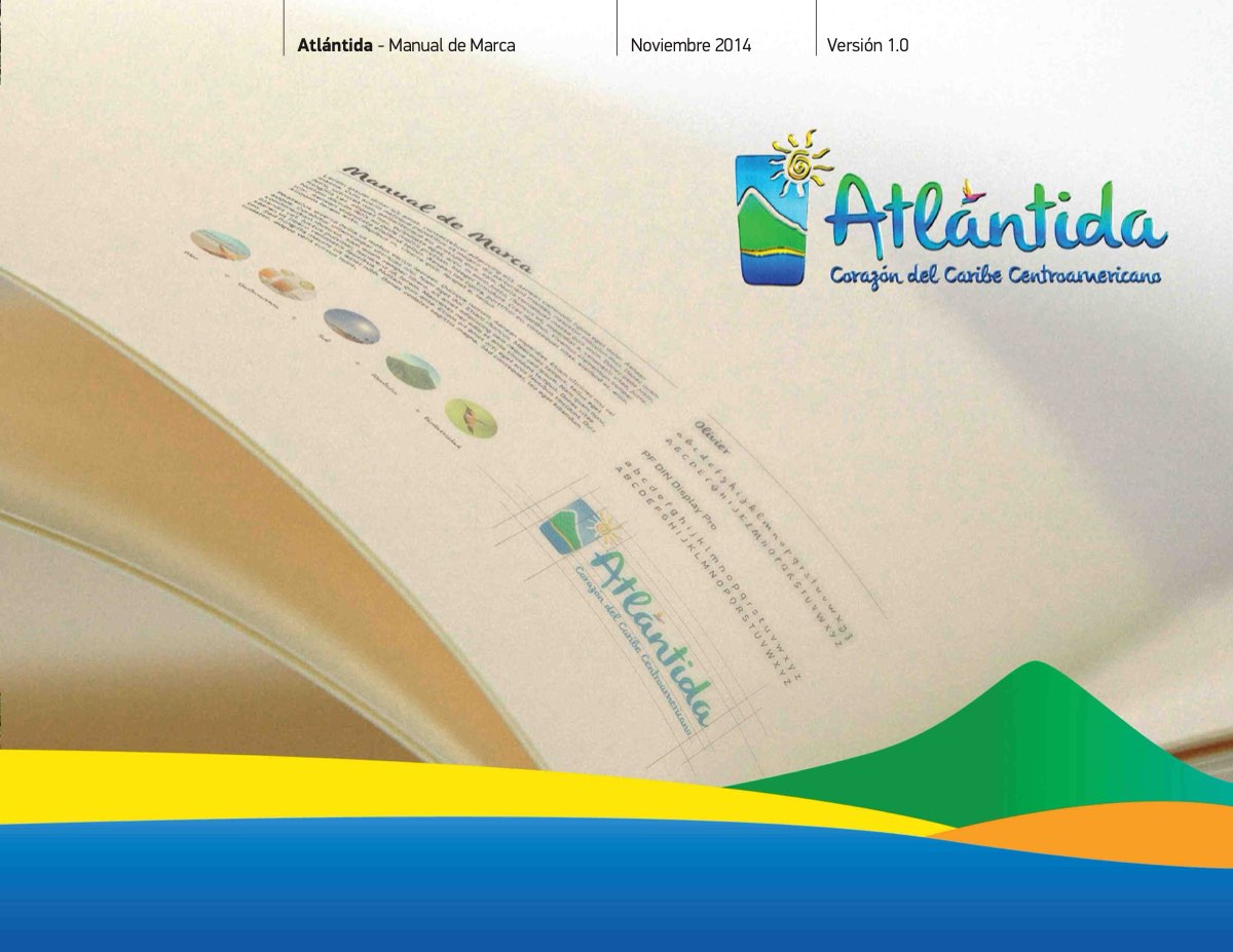
The cover. Atlántida · Manual de Marca · November 2014 · version 1.0.
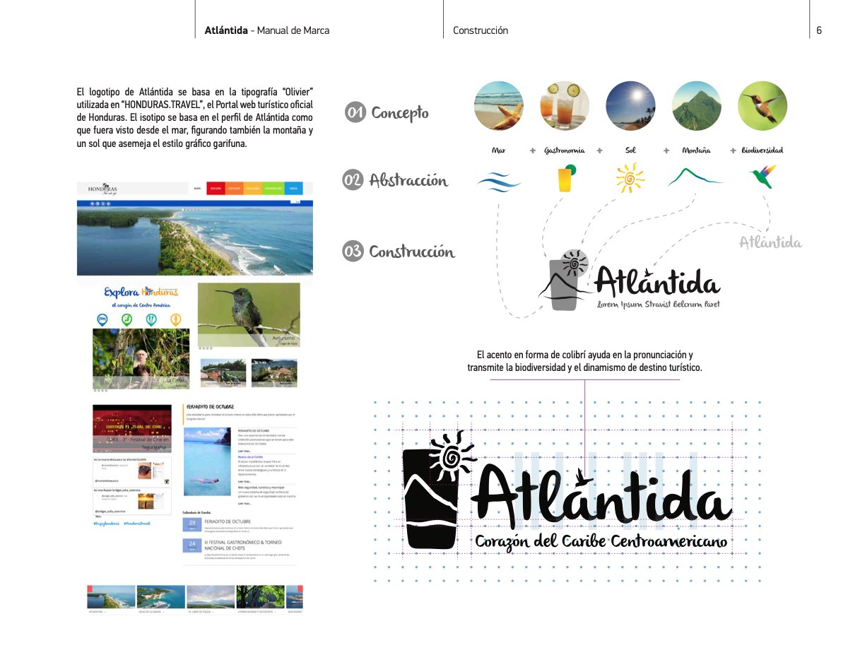
Concept to construction: the department's coast, sun and landscape abstracted into the mark, then set on its grid.
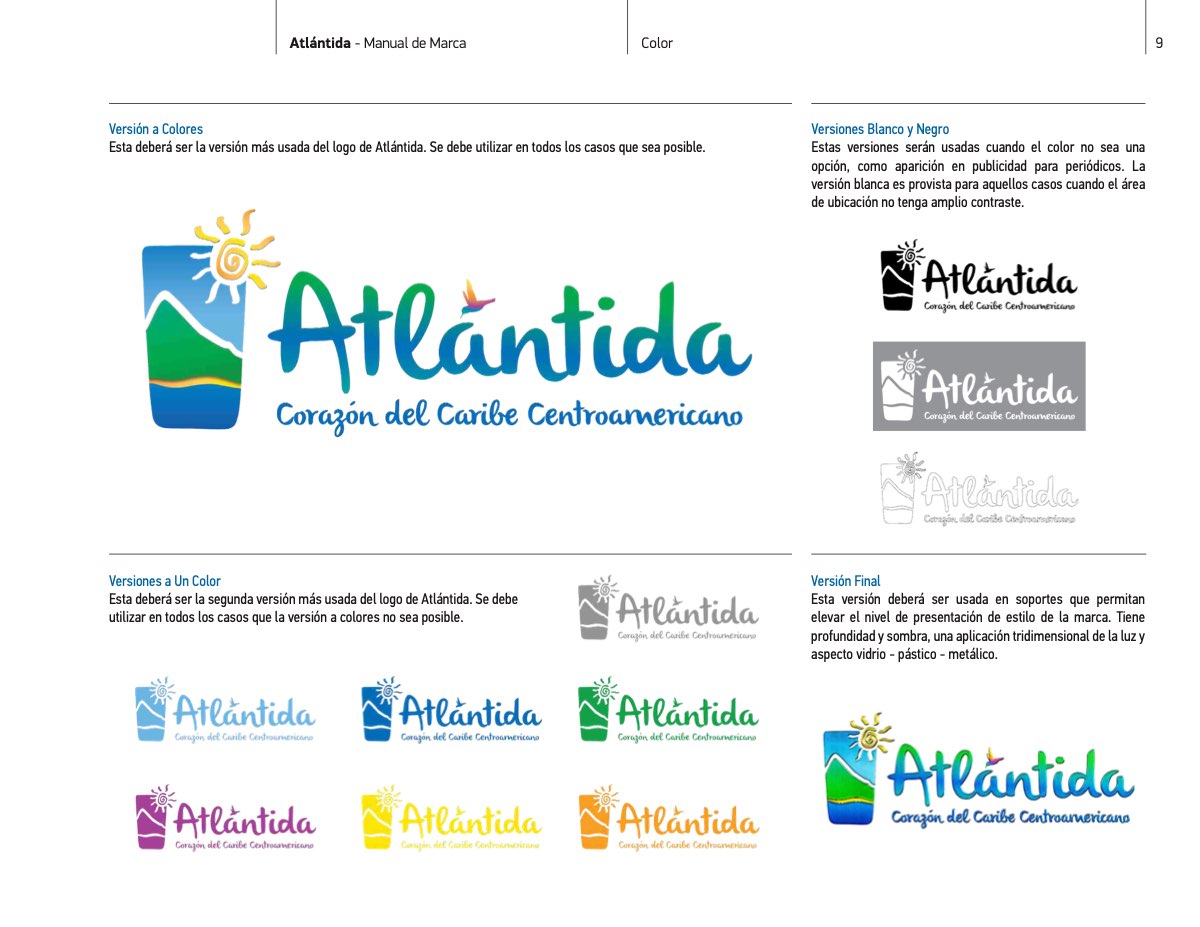
The logo in colour, and its single-colour and greyscale versions.
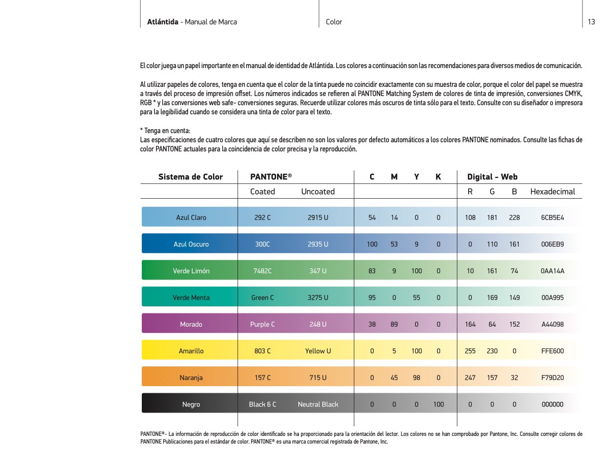
The palette, with each colour's Pantone, CMYK, RGB and hexadecimal values.
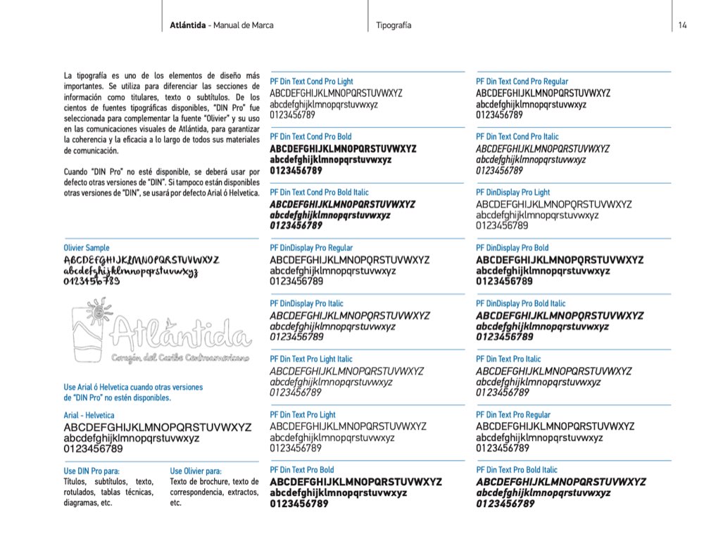
Typography: Olivier for headlines, DIN Pro for text, Arial or Helvetica where neither is available.
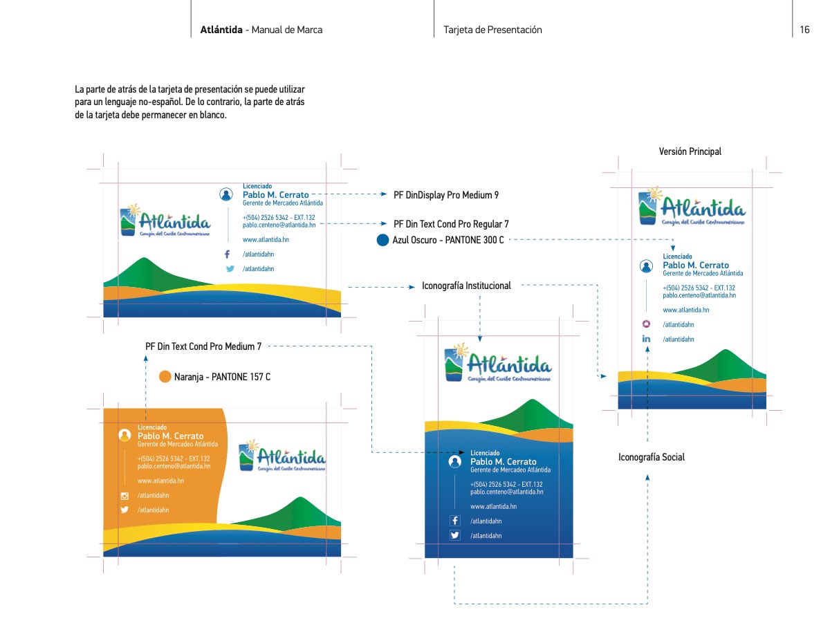
Stationery: the business card and its layout.
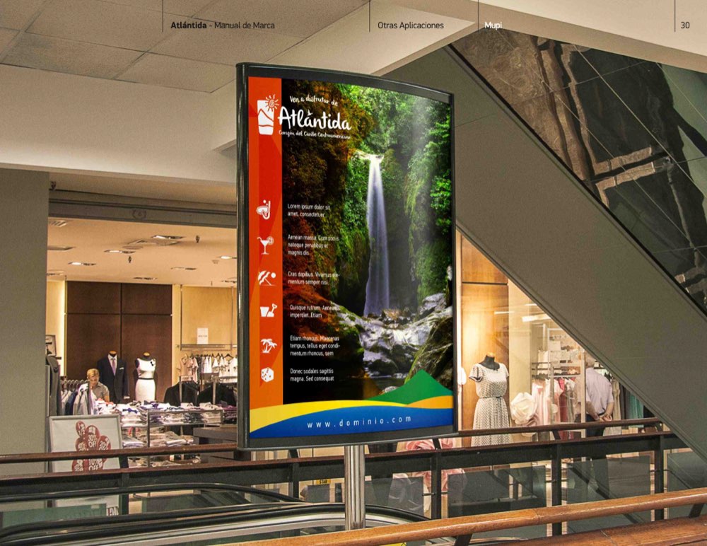
In use: a backlit display in a shopping centre.
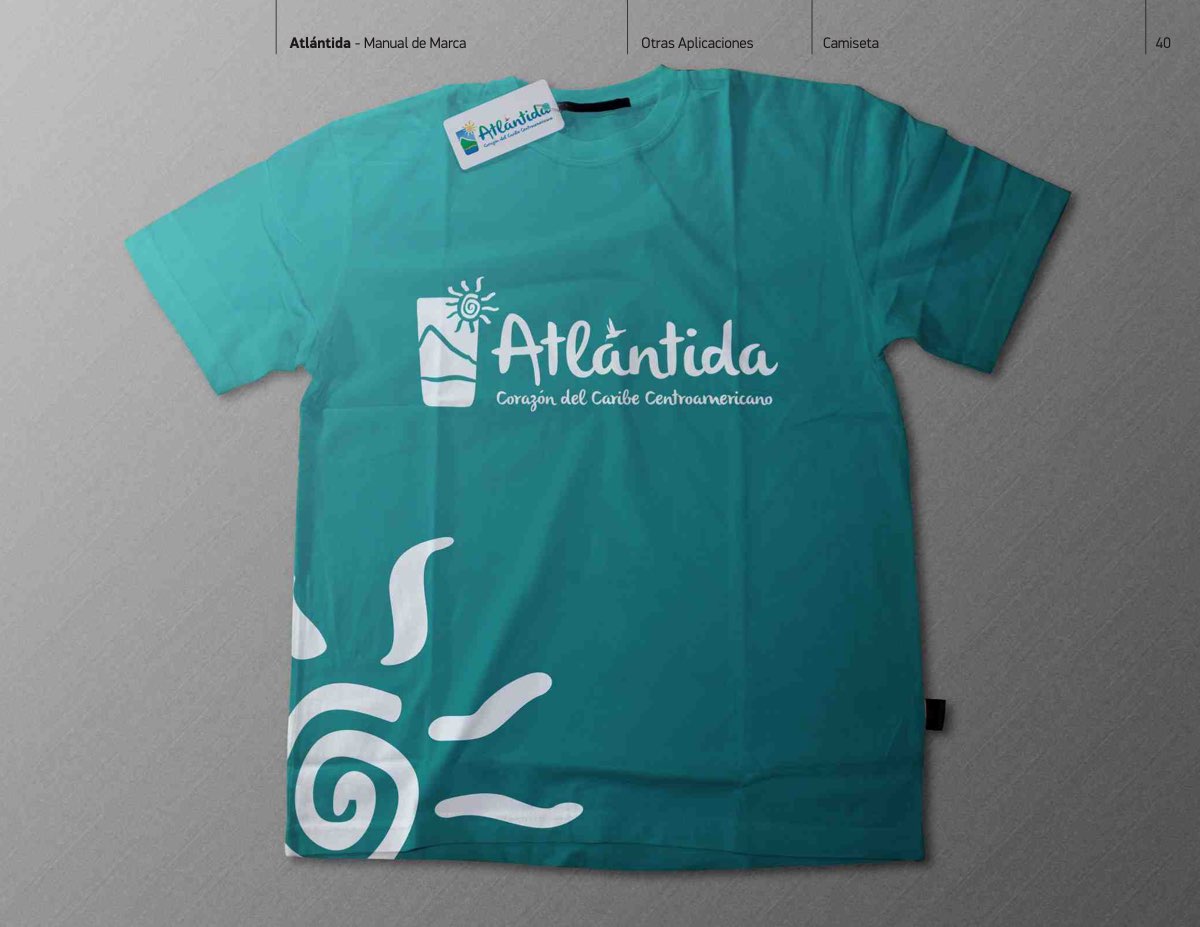
In use: a T-shirt carrying the brand's sun.
A brand that holds together everywhere?
Tell us where yours has to show up. We set out the system and the manual that keeps it consistent.
Let's talk