One homepage, six rounds, two days.
Agrega is an IT-services firm, with offices or phone lines in Honduras, Nicaragua, Costa Rica, El Salvador and the United States. It sells cybersecurity, service desks, IT operations and applications. On our own initiative we redesigned its homepage on its published content. Between 12 and 13 October 2026 the proposal went through six rounds, E1 to E6. This page puts them side by side, with what each round changed, why, and what we measured.
Nobody at Agrega commissioned this work, and Agrega has not adopted it. Every capture below is our proposal, not agrega.com.
Four figures from the six rounds.
The brief was ours, so we wrote it down first.
What agrega.com led with
Its hero read “Soluciones tecnológicas · al alcance de tu mano · Cotiza ahora” when we read it on 12 October 2026. Its four areas (cybersecurity, ITSM, IT operations and apps) and their twenty products sat in the menu.
What we set ourselves
One sentence on the first screen that names the work: “Ciberseguridad, mesas de servicio y monitoreo 24×7 para su operación de TI.” Everywhere else, Agrega’s published content and our rewrites, each rewrite marked as ours. From E1, a check failed whenever a string on the page could not be traced to agrega.com or to one of those marked lines.
What we checked on every link
The proposal builds every phone link from the digits it shows, and a check fails if one dials anything else. Where the published numbers could not settle which one was right, a note asks Agrega.
The six rounds, side by side.
The first screen of each round on a phone, as the round left it. Each one links to its round below. The strip at the top of every capture is the notice the private preview carried then; in E1 its “{{clausula}}” was a placeholder for a legal clause still to be written.
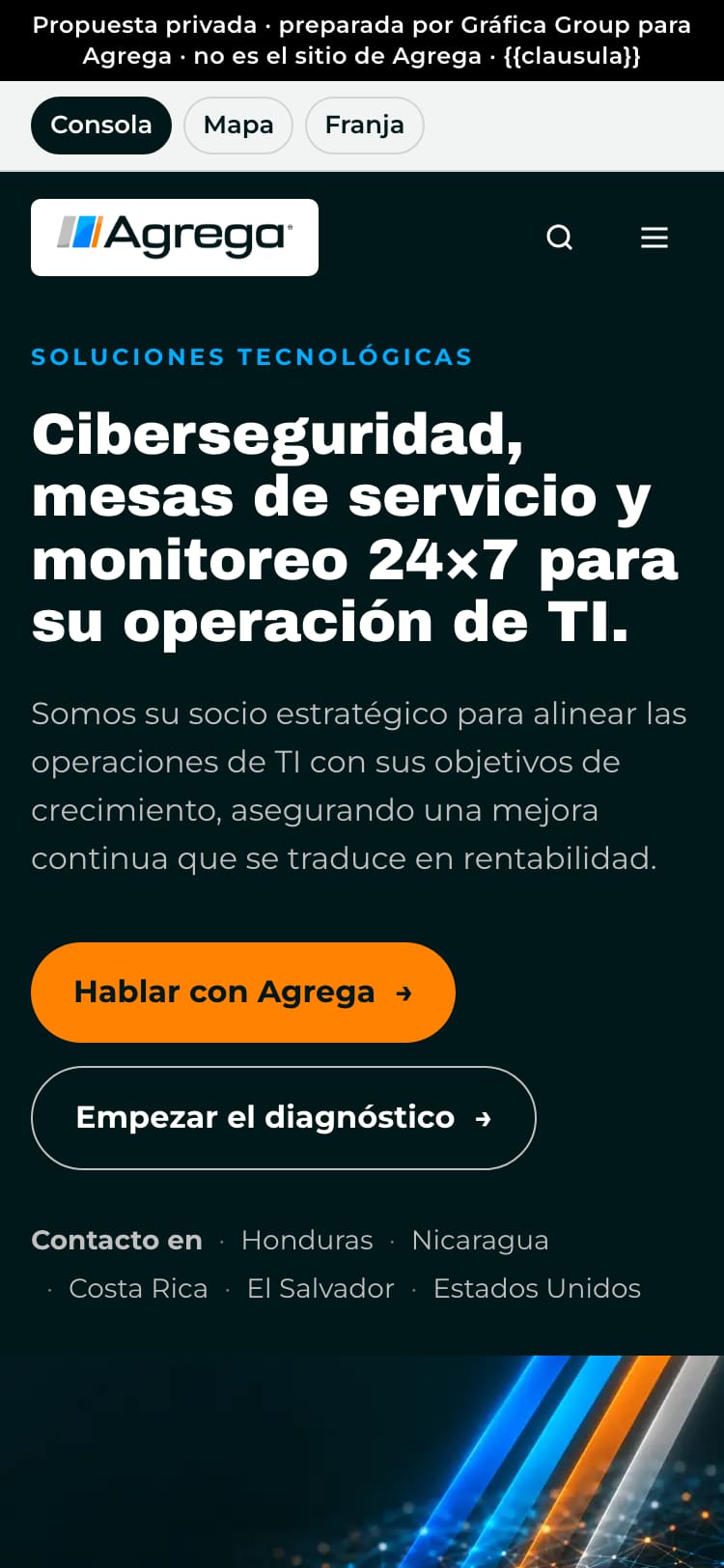 E1 · 12 Oct
Three directions
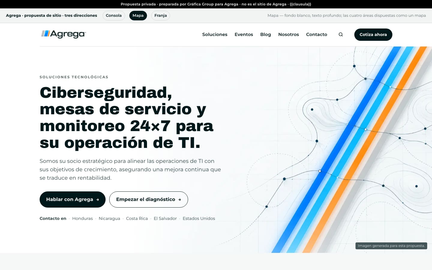
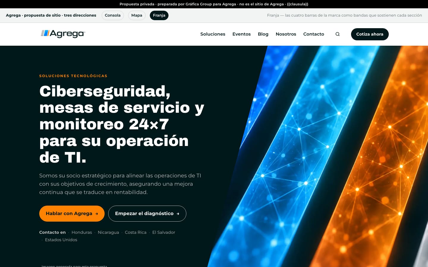
Three first screens: Consola, Mapa and Franja. Both critics ranked Consola last, and our founder picked it.
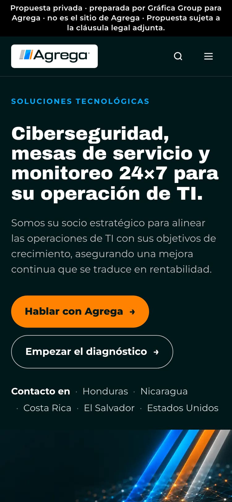 E2 · 12 Oct
The whole homepage
Every section built on Consola, its copy traced to agrega.com string by string. Seven notes for Agrega sit outside the site.
 E3 · 12 Oct
First review: nine items
A light bar with the original logo, the DDT faces, and buttons slanted like the logo’s slash. Two full-width bands carry Agrega’s own sentences.
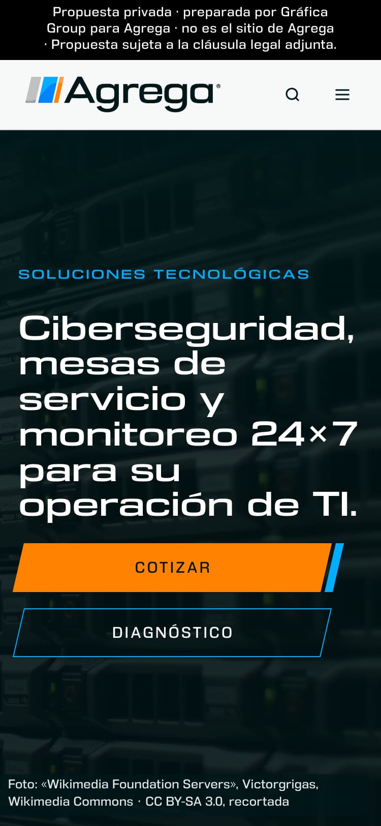 E4 · 12 Oct
24 notes
One button system, its slash measured on the logo at 13°. A licensed photograph replaces the generated hero.
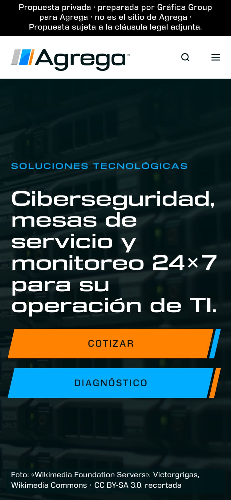 E5 · 12 and 13 Oct
16 notes
The logo centred by its ink: 4.8 px off the bar’s middle became 0.08 px. The phone menu rebuilt, and each of its 30 links tapped in a test.
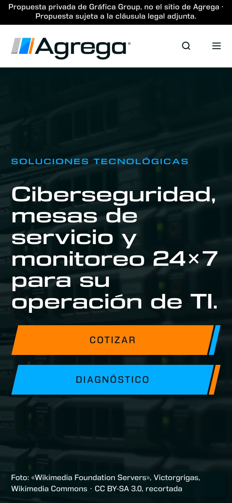 E6 · 13 Oct
Seven measured defects
Buttons inside the margins, partner logos at one optical size, footer contrast from 3.37 to 5.02:1. Two new designs tried and reverted.
Three directions before anything was built.
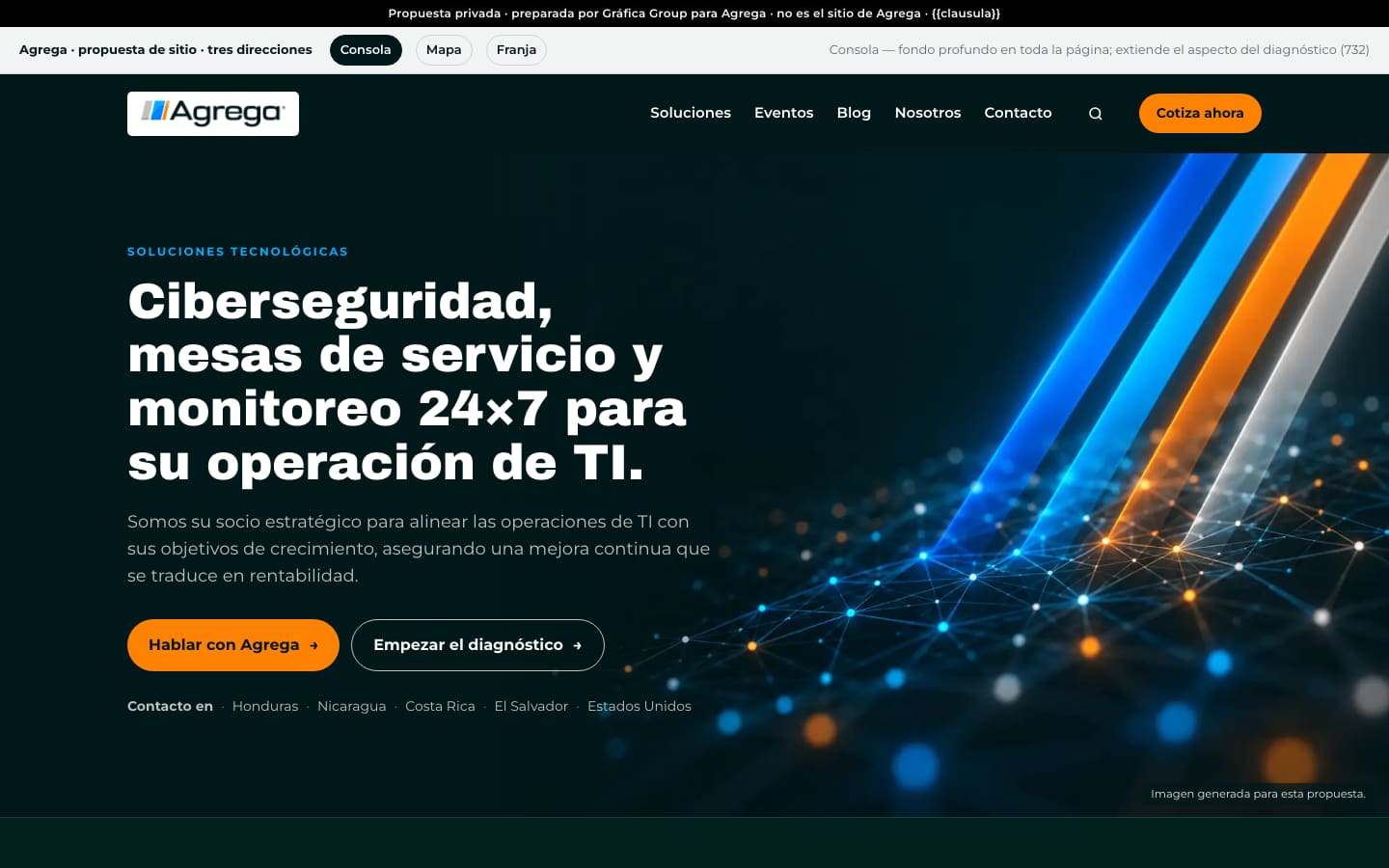
We start a redesign with three directions and have them judged before any of them is built. Consola kept a deep ground through the whole page. Mapa was white, with the four areas laid out as a map. Franja turned the logo’s four bars into bands that head each section. Each had its first screen, the solutions and the head of the diagnostic, and a hero image AI-generated for the proposal, with no text in it.
Two fresh AI critics read them cold: one as a designer, one briefed as an IT buyer. Both put Mapa first and Consola last. The buyer called Consola an “attacker dashboard”. Our founder picked Consola, and the next five rounds are built on it.
Measured
- All three directions on one page: 403 KB.
- Ten faults planted on purpose against its checks (an altered heading, an untraced line, a stock photo inlined, a link for someone else). All ten caught.
- Neither critic read the revision. Their verdicts stand on the screens before it.
The whole homepage, on Consola.
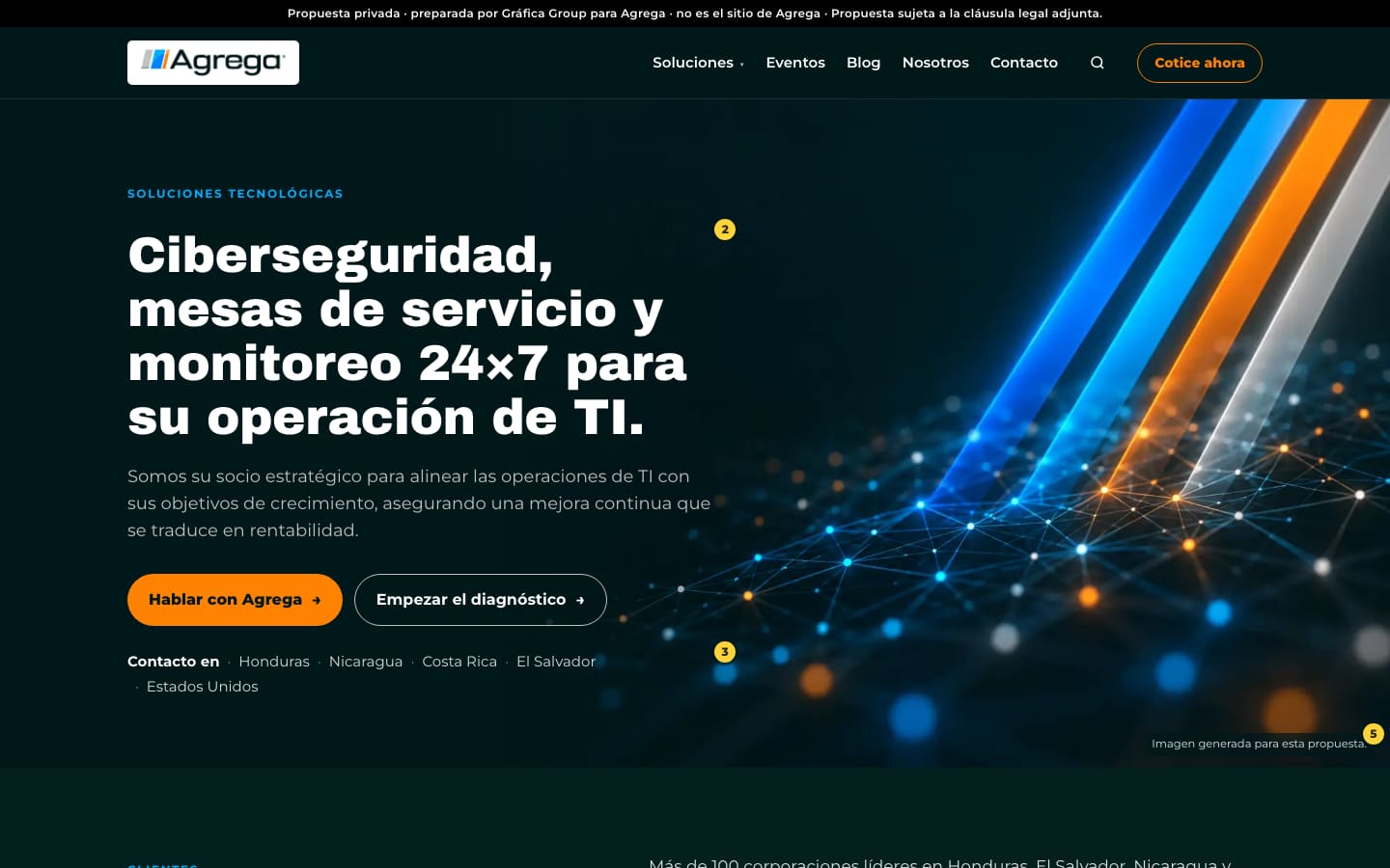
Built the same day on the picked direction: the header with all twenty products, the hero, Agrega’s paragraph on its more than 100 corporate clients kept word for word beside 13 partner logos, the four areas, a twelve-question diagnostic that ends in a PDF, the figures, the videos, contact for five countries and the footer.
What only Agrega could supply (who runs its 24×7 operation, named clients, credentials) went into seven numbered notes outside the site, never into the page. The buyer critic called three of those notes “exactly right”.
Measured
- 320 KB. In production, through its gate: no request to any other origin, and the diagnostic walked to its end and printed, two pages.
- Sixteen faults planted against eight checks, all caught. One of them points a phone link at the wrong number.
- The partner wall drew every logo 14 px wide on a phone. It was fixed the same day: two columns, logos 40 to 133 px wide.
- The first deploy failed to build. A size limit was suspected and never proven.
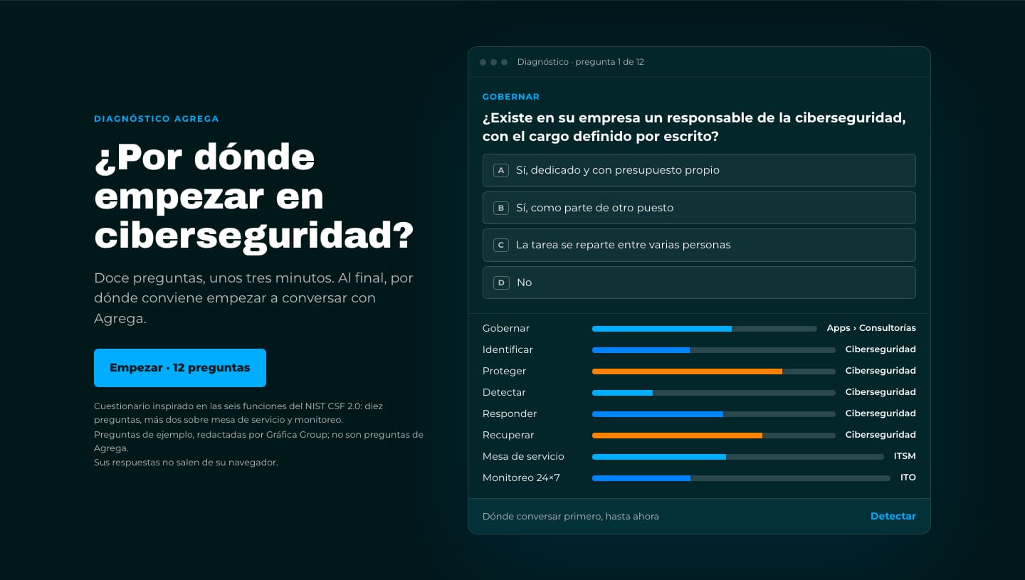
The first review: nine items.
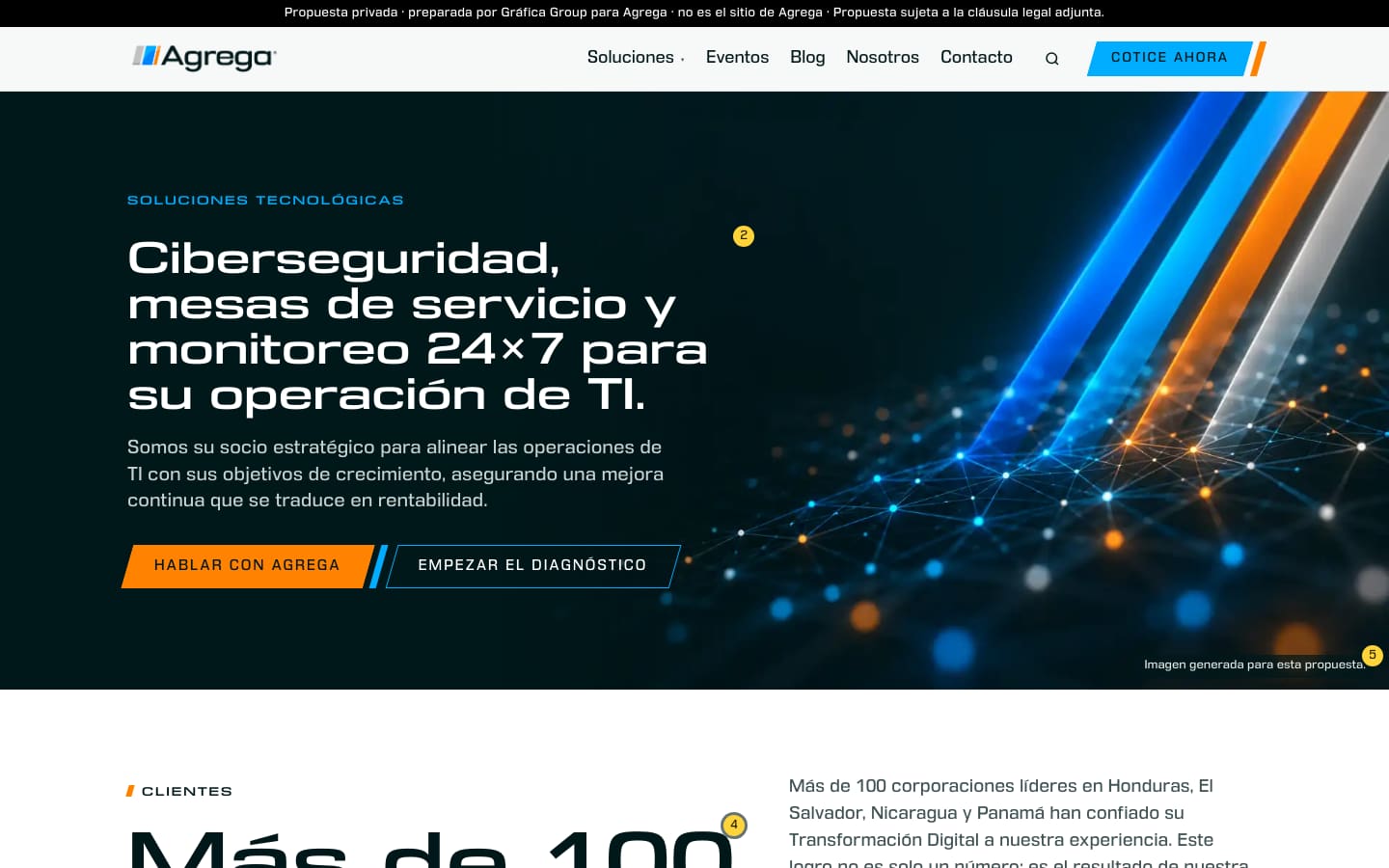
Our founder’s first review asked for nine things, and each one was built:
- the DDT faces for headings and text;
- a light bar with the original logo, no white plate;
- the solutions panel kept inside the window on tablets;
- a phone menu that scrolls. The cause was measured first: a blur filter on the bar had made it the menu’s containing block;
- agrega.com’s own favicon;
- buttons slanted like the logo’s slash, with a hover and a press;
- a simpler hero;
- no paragraph ending on a single word;
- dark and white sections in turn, with two full-width bands carrying Agrega’s own sentences.
Measured
- 307 KB, lighter than E2: the two DDT subsets weigh less than the faces they replaced.
- Read at 375, 390, 768, 1,024 and 1,440 px: nothing past the edge of the screen, and the phone menu scrolls to its last link.
- No design critic read this round.
24 notes, one check each.
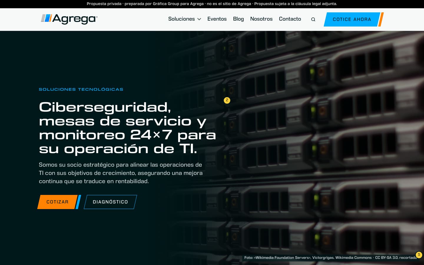
Each note became one change, plus one check that fails if the change is undone:
- the logo from 34 to 44 px;
- one button geometry, 48 px high, its slash at the logo’s own angle and gap, measured on the logo file: 13°, and a gap of 6/81 of its height;
- labels of two words at most (“Hablar con Agrega” became “Cotizar”);
- a hero the height of the screen;
- a licensed photograph instead of the generated image;
- the nav’s hover drawn as the logo’s orange slash;
- a heading for the clients, the partner logos centred, linked, and grey until hovered;
- figures that count up;
- a footer in four columns.
Measured
- 54 faults planted, all caught. 27 of them were new, at least one for each note.
- 440 KB, up from 307 KB, most of it the photograph.
- A copy critic and a fresh re-check on every new Spanish line. One heading moved from “confían” to “han confiado”, the tense of Agrega’s own paragraph.
16 notes, five review passes.
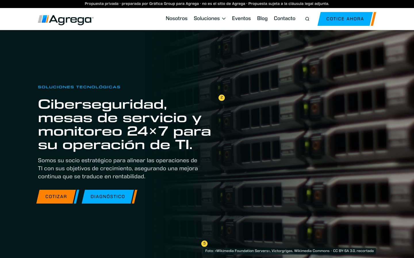
The logo had been centred on the bar by its box, and its slashes and capitals stood 4.8 px above the bar’s middle. We moved the image by 15/140 of its own height, and they now sit 0.08 px off.
The other fifteen notes, in short:
- the nav in the order of the page’s sections, with the current one marked;
- every button solid, with one blue and one orange in each pair;
- counters that start only once they are in view;
- the nav’s breakpoint moved, so its links never wrap;
- the phone menu rebuilt: it holds the page still, folds, and closes.
Measured
- 114 faults planted, all caught, in a final run with no other browser on the machine.
- Line endings, cards and the nav read at every width from 320 to 1,440 px.
- Five review passes, by eye at six widths and in the code. About 10 hours, the longest round.
- One of the round’s own fixes left 24 of 25 controls hidden under the sticky bar when reached with Shift+Tab. The next review pass found it, and the following fix corrected it.
- Read only in headless Chrome, never on a real iPhone.
Seven defects, measured, then fixed.
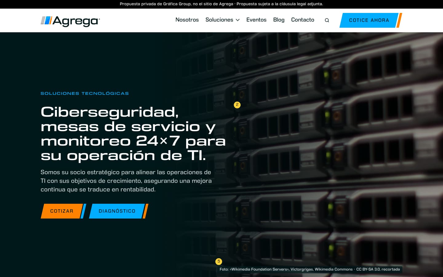
Our founder named seven defects in E5. Each was measured, fixed and read back:
- buttons whose ground ran 5.54 px past the column now sit inside it;
- the floating “Cotizar” on phones steps aside for any heading under it;
- the notice at the top fits two lines from 360 to 414 px;
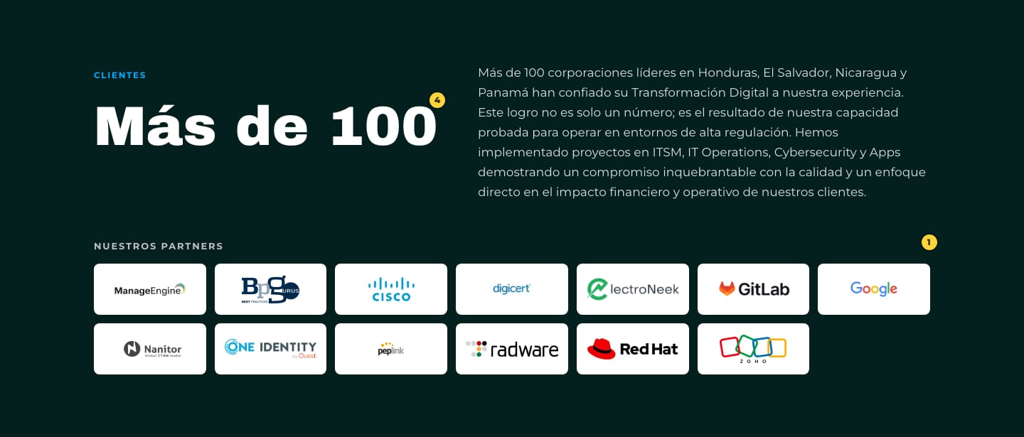
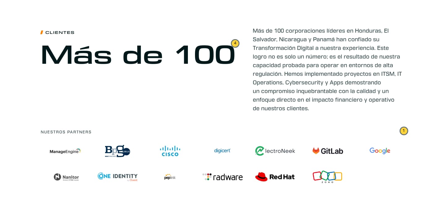
- in the clients section, E5 had aligned the small label, but his note meant the heading. The heading now starts 0.00 to 0.01 px from the paragraph’s first line;
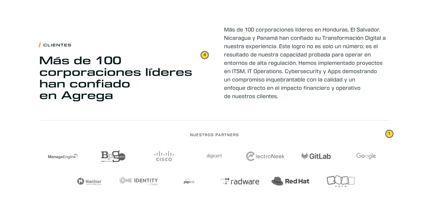
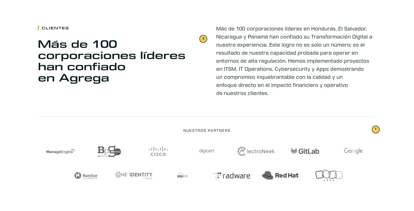
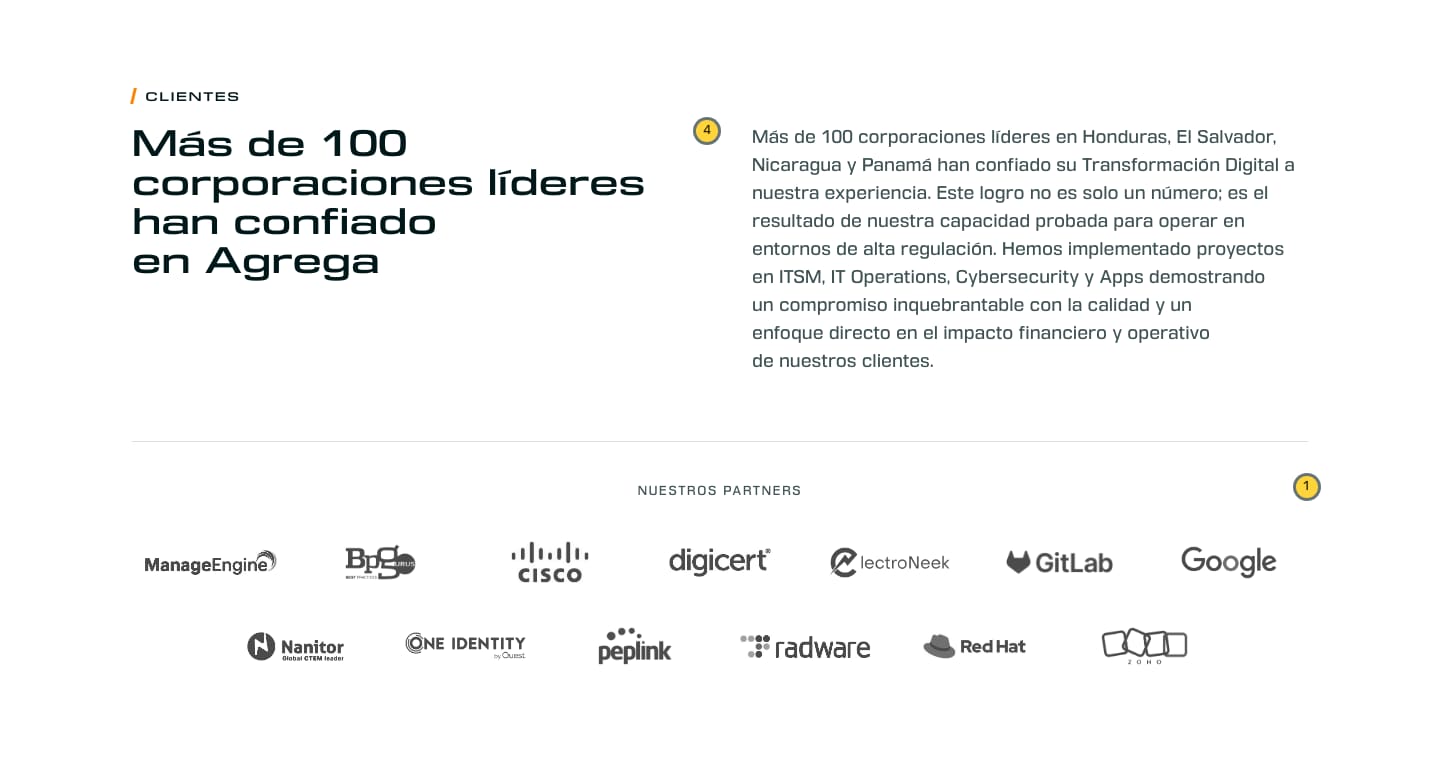
- the 13 partner logos were re-cut to their ink. Their visual weight went from a 6.4× spread to 1.48×, in one grey at 8.5:1, where 8 of 13 had been under 3:1 on white;
- the footer’s small text went from 3.37:1 to 5.02:1;
- and one gap in our report, not the page: E5’s had no captures at 1440 px. E6’s has sixteen.
Measured
- 533 KB. 22 of the round’s 25 planted faults caught.
- Four changes beyond his list, each judged clearly better than E5 by a fresh critic. Two of them: no country card and no partner logo left alone on its row.
- Two new designs were built and reverted. Beside the band’s sentence, a critic found the added line repeated the headline, and our founder sent the list that replaced it back. For the four area cards, a critic rejected the first set of photographs as unrelated frames and the re-check judged the second not clearly better than E5.
- The round’s last check run ended in a failure. Three planted faults no longer fit the reverted page, and were recorded, not repaired.
The clients, from E2 to E6.
The same paragraph of Agrega’s and the same thirteen partners, at 1440 px, as each round left them.
The first full-width band, from E3 to E5.
Our founder’s note after E3: “I really like the full overlays.” E6 kept E5’s band exactly, on his word.



Where the six rounds ended.
E6, the proposal
One sentence on the first screen names the work, and the rest is Agrega’s published content or a marked rewrite of it. A visitor can finish the twelve-question diagnostic and keep its PDF. The thirteen partners sit at one optical size. Checks read its line endings and its buttons at every width from 320 to 1,440 px. It loads nothing from any other origin (measured 23 October 2026).
What it cost
About 21 hours of session time across the six rounds, E5 alone about 10. That leaves out the planning before E1, the diagnostic built before it, and project management. The rounds used 48 AI agents as critics, reviewers and researchers, in 11 review rounds.
What this page does not claim.
Agrega’s site is Agrega’s
We proposed this on our own initiative. Agrega did not commission it and has not adopted it, and nothing of it was applied to agrega.com.
Captures of the build
Every capture was rendered on 23 October 2026 from each round’s own saved build, in headless Chrome, at 1440 × 900 and 375 × 812, with reduced motion. None is a photograph of a phone, and the rounds were never read on a real iPhone. The figures come from the rounds’ own reports, measured on the build in October 2026.
Whose pictures
The hero image of E1 to E3 and the four area images were AI-generated for the proposal. From E4 the hero is “Wikimedia Foundation Servers-8055 13.jpg” by Victorgrigas, CC BY-SA 3.0, cropped and darkened; the adapted image is under the same licence. The E4 to E6 captures above show it. Agrega’s logo, its partners’ logos and the flags belong to their owners, taken from agrega.com.
See the proposal itself.
The E6 page, with the notes it carried for its reader, is published with our other redesign proposals.
Open the proposal